
Common Website Design Mistakes will b described in this article. If the visitors find inconsistencies in your website design, they’ll not trust your business. Such mistakes can damage your reputation and lead to lost customers. According to Web FX, 75% of your company’s trustworthiness comes only from its website design. So, in this blog, we’ll delve into 13 common website design mistakes to avoid, as advised by expert web designers worldwide.
Top Common Website Design Mistakes To Avoid In 2024
In this article, you can know about Common Website Design Mistakes here are the details below;
Common Website Design Mistakes to Avoid
Sometimes, you may make mistakes while creating a website. No matter how silly the mistake is, it will cost you a lot. So, let’s know the common mistakes and avoid them immediately.
1. Poor Website Navigation
Easy navigation is the backbone of a user-friendly website. On the other hand, a complex or confusing navigation structure can frustrate your users, causing them to abandon your site. According to the study by Top Design Firms
38% of the Users Look at the Layout or the Navigational Links of the Website When Visiting & the Website for the First Time. If they find it difficult to navigate, they will leave your site.
If your website ends up with poor navigation, all of your time and effort will go in vain. Therefore, you should be careful of this design mistake from the very beginning of creating your website. Moreover, you can analyze different website layouts for gathering a solid understanding.
2. A Non-Responsive Site
Mobile browsing is not a trend – it’s a mainstream mode of accessing online content. Exploding Topics reported 56.96% of global website traffic was generated by mobile devices, excluding tablets, as of August 2023.
Users now, more than ever, are visiting websites from multiple devices; phones, tablets, laptops,even TVs. If content looks poorly on any of them, visitors will lose trust & the click/tap away from the site.
So, while designing your website, you must avoid making this mistake. You should ensure your website looks good on different devices. If users can’t browse smoothly from other devices, you’ll definitely lose them.
3. Inappropriate CTA Placement
Call-to-action (CTAs) serve as your digital salespeople, guiding visitors toward conversions. However, randomly placing your CTAs is a severe website design mistake. Digital marketing expert Neil Patel has highlighted the significance of well-placed CTAs. He explains that the strategic positioning of CTAs can lead to over a 120% increase in conversions.
Eye-tracking studies have shown users tend to focus on the upper left corner of webpage, known as the “F-pattern.” So, you should place CTAs in this area to increase visibility and user engagement. This website design trends will make you different from others.
4. Unoptimized & Large Images
An egregious offender in the world of website design mistakes is the use of unoptimized and large images. Why? Because it directly impacts your website’s performance and user experience.
Let’s break it down. Unoptimized images are the ones with larger-than-necessary file sizes. When these images are included on your website, they can significantly slow the loading times. A sluggish website spells disaster in an age where speed is king and visitors expect near-instant gratification. You risk losing potential customers and, consequently, potential revenue.
Google also keeps tabs on your website’s speed. If your site consistently underperforms, your search engine ranking will suffer. But it doesn’t have to be this way. There are numerous image editing tools available. You can use them to compress and resize your images without compromising quality.
5. Disruptive Pop-Ups
No doubt, it’s a proven tool for collecting leads. If you use pop-ups correctly, you can increase your email subscribers by up to 1,375%. But the problem arises when pop-ups interrupt and annoy your visitors. Google states that sites with annoying pop-ups may not rank high on SERPs.
So, what’s the solution? Create visually appealing and highly converting pop-ups that won’t annoy them. For , you can time pop-up to appear after a visitor has spent 30 seconds on your site or once they have scrolled halfway down the page.
6. Not Having a 404 Page
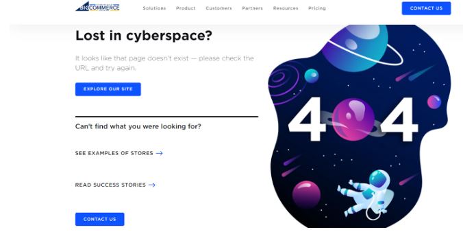
Not integrating a 404 page is a substantial website design mistake. It can turn a minor glitch into a full-fledged user experience catastrophe. Picture this scenario: A visitor has just clicked on a broken link while browsing your website. As a result, he’s met a dead end with a generic error message. At this point, he’ll get confused, thinking where to go. Unfortunately, he’ll leave your site.
But if you have a brand-aligned 404 page, you can easily & theredirect your visitors to the expected destination. You can convert your visitors’ frustration into a smile. Let’s see an example of a well-crafted 404 page created by BigCommerce.
Here, you can easily notice this 404 page offers CTAs and navigational links so that visitors can take their desired action. A thoughtfully designed 404 page can serve as your user’s roadmap back to engagement, retaining their interest even in the face of errors.
7. Choosing an Unclear Font
Choosing a font that is the difficult to read due to its style, size, or color is akin to appointing an unclear, inaudible guide. Let’s look at the image below. It’s written utilizing a fort known as “Bedtime Stories.”
Can you read the message? Surely not. It’s purely unreadable.
If you use such fonts in your website, your users may struggle to navigate your site. They’ll miss details or, worst of all, leave out of sheer frustration. It’ll result in higher bounce rates and lower engagement.
Remember, even a conventional font can become unclear if its size is too small for comfortable reading or if there’s insufficient contrast between the text and background color.
Website accessibility guidelines recommend a minimum font size of 16 pixels for body text. Similarly, the contrast ratio should be at least 4.5:1 for normal text to ensure legibility for all users, including those with visual impairments.
8. Poor Use of Whitespace

Whitespace is the area on your web page that is left unmarked. Its function is to provide visual breathing room for the eye, a break in the sea of text and images.
The poor use of whitespace can result in a cluttered, disorganized web page. When information and visual elements are crammed together without sufficient space to separate and highlight them, your website becomes difficult to navigate.
On the flip side, overuse of whitespace can also be detrimental, creating a sense of emptiness and detachment if not properly balanced. It may make visitors perceive a lack of content, leaving them unsure of the next steps.
In these examples, you can notice that whitespace is not utilized properly.
Remember, in web design, every pixel counts, including the empty ones. Whitespace is not merely a passive, empty space but an active tool that structures content and shapes the user’s journey through your site.
Take Google’s search page, for example where you will find the perfect balance of whitespace.
9. Centering Website Logo
Users were 6 times & likely to fail to the navigate to the homepage in a single click when site logo was centered versus left aligned.
Lets’ see an example from the survey. Stella and Dot’s website has a left-aligned logo. As a result, users can easily navigate to the homepage from other pages with just one click.
On the other hand, Madewell’s website has a centered logo. Some users could not return to the home page with just one click. They had to click other links before reaching the homepage.
That’s not to say a centered logo can never work. A centered logo can contribute to an overall balanced aesthetic in some website designs, especially for creative or visually-driven websites. But you can provide a smooth and user-friendly experience to your visitors by keeping your logo to the left.
10. Slow Page Load Speed
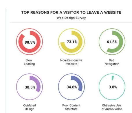
Statistics reveal a clear correlation between load time and user behavior. According to a study, your conversion rates will decrease by 7% because of a mere 100-millisecond delay in your website load time.
Furthermore, Google’s research indicates that as the load time of a page goes from one to five seconds, the bounce rate increases by a staggering 90%. GoodFirms conducted a survey and found that slow page loading speed is the prime reason for leaving a site.
These figures underline the harsh truth: today’s users expect websites to load swiftly and seamlessly. Any failure to meet these expectations can result in lost opportunities and diminishing returns.
11. Not Having a Privacy Policy Page
Data protection and user privacy are significantly important for modern websites. However, many businesses make the mistake of not having a privacy policy page.
Failure to provide a privacy policy can raise red flags for your visitors. It can breed distrust and make your website appear less professional and reliable. A user who cannot find information about your data handling practices may choose to take their business elsewhere.
According to a survey by the Pew Research Center, 79% of US adults report being concerned about how companies use their data. Moreover, privacy laws like the GDPR and the CCPA mandate a clear and accessible privacy policy on websites that collect user data. If you can not ensure these laws, it can result in hefty fines.
12. Unclear Brand Messaging
When it comes to website design, one of the most common mistakes is having unclear brand messaging. Your website should clearly communicate what your brand is all about and what you have to offer. Also check Websites Like Amazon
Sean Landry, Principal Product Designer at HubSpot, said,
The first thing a website & the visitor does when they load your site is to the determine they reached the right destination.
If visitors are confused about your brand or what you do, they are likely to leave your site without taking any action.
To avoid this mistake, ensure your brand messaging is concise, compelling, and prominently displayed on your website.
13. Overlooking Web Design Laws and Principles
If you think web design is just an artistic approach, you’re wrong because it’s backed by scientific laws and principles. Principles such as Fitt’s Law in interface design or the Gestalt Principles are foundational to creating user-friendly websites. If you ignore these rules, it can lead to cluttered layouts and disoriented users.
A study shared by Adobe highlighted
38% of the people &the stop engaging with website content or layout is unattractive.
Therefore, you should implement web design laws and principles to avoid common website design mistake.
What factors make a good website?
There are several qualities of a good website. Here are some of them.
- Easy navigation
- Responsive design
- Relevant and updated user-centered content
- Fast page loading speed
- Clear CTAs
- High security
What are the seven principles of the web design?
These are the seven principles of web design:
- Proportion
- Contrast
- Hierarchy
- Emphasis
- Pattern
- Balance
- White space
How do I fix bad website design?
Rectifying a bad website design starts with identifying the problem areas. Once identified, formulating a detailed plan to tackle these issues and implementing the changes will lead to improved design.
The process may involve UI/UX improvements, speed optimization, content update, or complete visual redesign.
Conclusion
A well-designed website can enhance user experience, boost your SEO, and increase conversions. However, certain website design mistakes can hinder your site’s performance and drive visitors away.
So, always check above mentioned mistakes when designing your websites. That will help you to build trust with your audiences and grow your business.


Add Comment